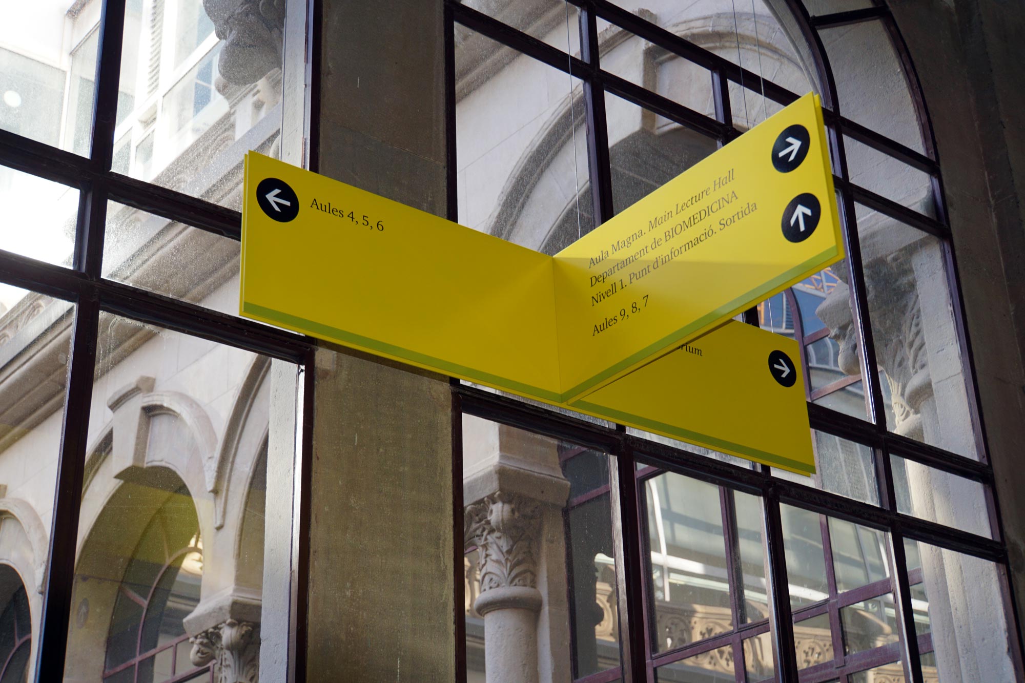
Minimal impact, maximum effect
Designing signage for the interior space of any building, corporation or shopping centre, has a fundamental prerequisite: that its visual impact must not be overbearing. The saying that ‘less is more’ is essential in this case.
The minimum number of sign units necessary to solve the problem of locating our destination and identifying it in a space that is unknown a priori must be determined. We must determine the minimum number of signs required when faced with the challenge of both finding and recognising our destination when visiting a place of which we have no prior knowledge.
The second challenge is to adapt the aesthetic to the existing interior design, combining materials and finishes that complement the project. It is essential to understand the architectural and interior design so that the signage does not clash, instead fitting in as part of the overall project. The materials and finishes used must relate and be consistent with existing ones.
Interior signage should take into consideration the individual visual identity features of the company requiring our services. The graphics, the colour or typographic solutions will be recognisable as belonging to the corporate identity of our client. Our experience covers hundreds of corporate buildings, offices, hospitals, hotels, shopping centres, AVE train stations, airports, and many more. We work on each project using ad hoc designs in order to achieve a satisfactory result in every case.

At Signes we have developed and designed (together with the Institut Català de Tecnologia) the SIS interior signage modular system, manufactured with aluminium extrusion slats. It is a functional and economical industrial solution for urgent projects requiring immediate production.
The rear slats are set back, creating the impression that the signs ‘float’ on the wall. It is a versatile, quality solution at a competitive price.
We realised some time ago that our company could contribute much more than just the manufacturing aspect when it comes to improving signage issues. We dared to undertake the most difficult aspect: the typography, because it is an essential part of any graphic project. Along with Andreu Balius, one of the most recognised experts in the field, we have developed a typographic family specially designed for signage projects. We call it DSIGNES. It has three declinations — Light, Regular and Bold. We are very happy to be able to offer it to designers and architects so that they may make good use of it.
It is free to use and can be requested at latipodsignes@signes.es.
